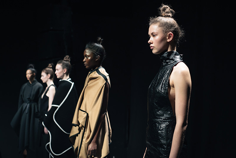
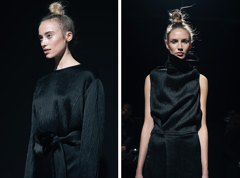

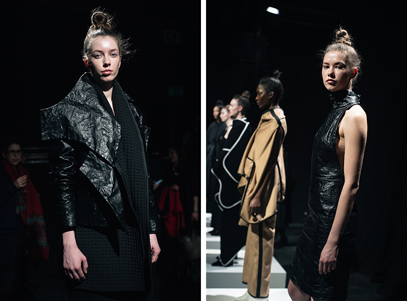
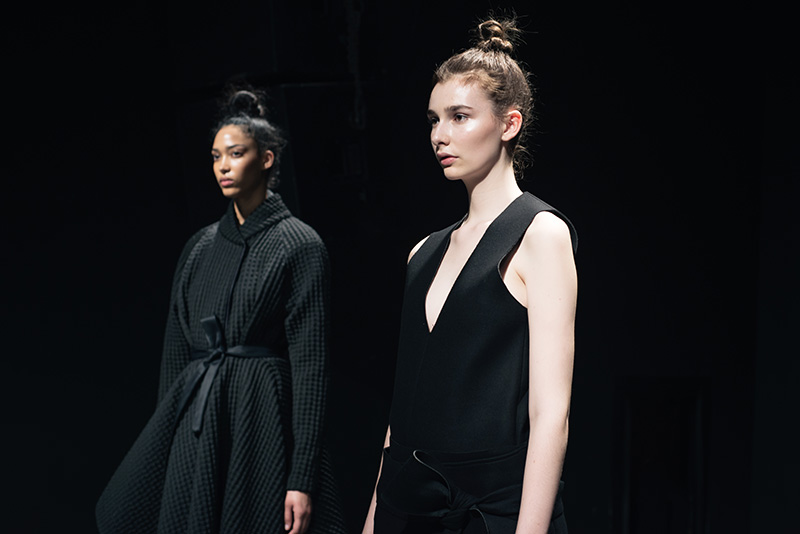
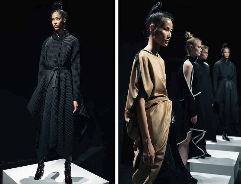
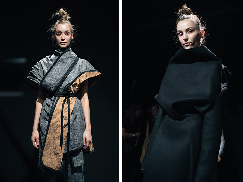
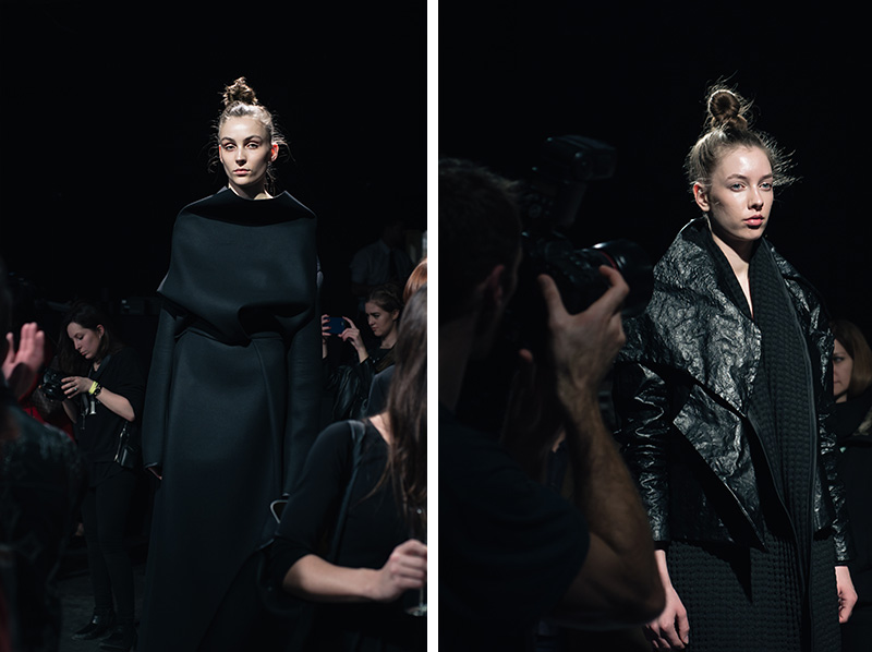
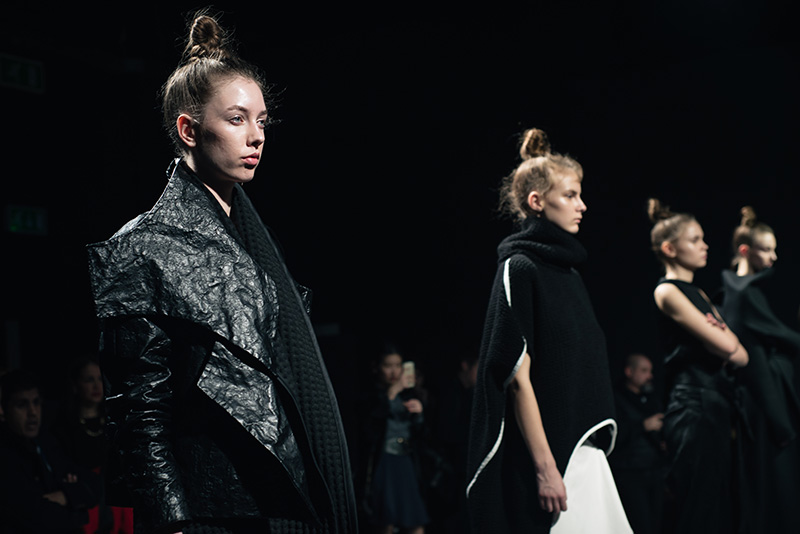
Sid Neigum Autumn Winter 2016 presentation / Institute of Contemporary Arts, London
This post is quite belated as I was having a bit of a ‘my work is rubbish’ crisis and was convinced all of my shots of this collection (and everything else I shot over LFW) were all too awful to publish. I’m sure all creatives can understand this and have been through similar themselves too. I’m my own worst critic and though sometimes I think this is a good thing as it pushes me to strive to be even better, sometimes it can be quite crippling. This is especially true when it’s something like photography, which always makes me feel like a bit of a fraud as I’ve never really learned the craft, I just kind of picked up a camera and played around with it. Having looked back over these shots recently though, I realised that maybe I was being a little harsh on myself, but mostly that this was just too good of a collection to not feature and share with you all.
Sid Neigum is a Toronto based conceptual, interdisciplinary womenswear label. Favouring an experimental approach using innovative fabrics and the precision and reasoning of a mathematician, Neigum applies modular origami and packaging design techniques to create his signature minimal yet maximal designs.
Drawing inspiration from Le Corbusier’s landmark tome The Modulor, for AW16 pieces were cut using the golden ratio, imbuing the collection with structural and symbolic balance. Le Corbusier harnessed the proportions of the human body to perfect his architectural works, describing his system as ‘a range of harmonious measurements to suit the human scale’. Neigum has translated these principals into a collection of garments which effortlessly envelope the body, softly structured and beautifully cut, these pieces have a modern, easy elegance about them.
The predominantly black colour palette came in richly textured wools, neoprene, crinkled silks and metal blends which could be shaped and scrunched into place. Highlights of warm camel, charcoal grey and white provided a beautiful contrast whilst still in keeping with the dark and dramatic feel of the collection. The quality of the pieces and their craftsmanship really shone through too, and Neigum has crafted the perfect blend of contrasting elements here – hard and soft, modern but classic, relaxed and easy, yet statement making.


Jenny says
These shots are incredible! You should be proud, you captured the moment really well and I totally understand what you mean about being hard on yourself but you really excelled with these! :) I love the collection and the shapes/materials used to create structure and depth. x
http://www.krystelcouture.com
FAIIINT says
Ahh, thankyou so much Jenny! <3 I agree, great use of silhouette and texture here.
Martina says
Relax – your photography is fine! :) But I know that feeling too…
Maria says
I always love your photos and this collection looks right up your street!
Maria xxx