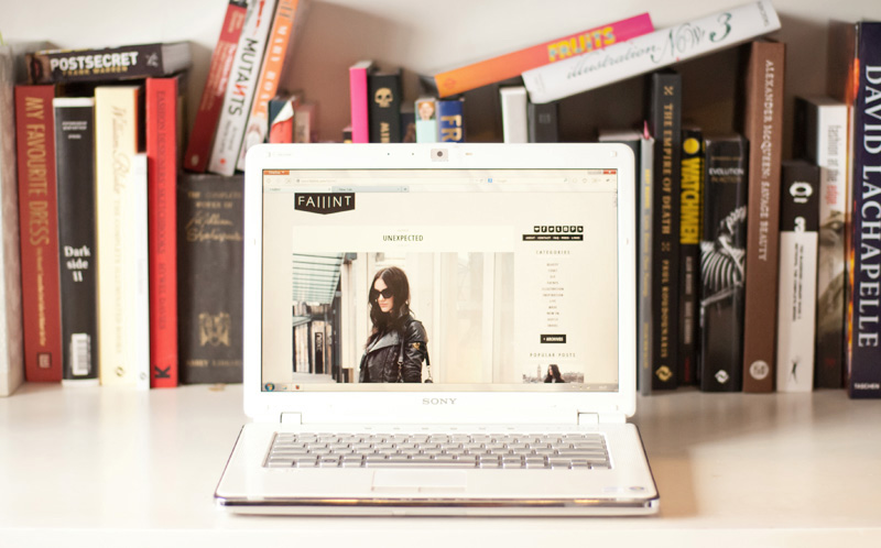
You might have noticed things are looking a little different around here & this new layout has been so long overdue. I never expected blogging to be something I’d actually keep up for this long, so the first layout was pretty rushed & it was mostly a case of it’ll do for now. I promised myself I’d redo the layout for the blogs 1st birthday, but that came & went and I never found the time to do it. So, with nothing more exciting planned this weekend I decided to finally get to work on something a little more fitting.
It’s not drastically different, I just wanted something a little cleaner, more graphic & something that better fitted with the aesthetics of the blog. I seriously contemplated going for a black background (à la Le 21ème – swoon), but decided lighter was more user friendly when there’s text to be read. The most noticeable change however, other than a generally cleaner look, is obviously the huge images. Ollie’s photography is such a massive part of this blog and I felt like it wasn’t being shown off to it’s full potential in that tiny column before, so here they take center stage.
I hope you guys like it as much as I do. If you have any comments or suggestions (good or bad!) on how it all looks, I would love to hear your opinions. But especially if somethings not working right, or looks squiffy on your end, then please do let me know so I can get it fixed! I’m sure there’s a few little things I’ve missed, but hopefully everything else is in good working order!
PS: That photo up there was taken by me, not Ollie, I think he better watch out – I’m learning! Hah!


