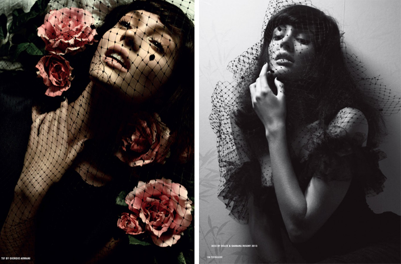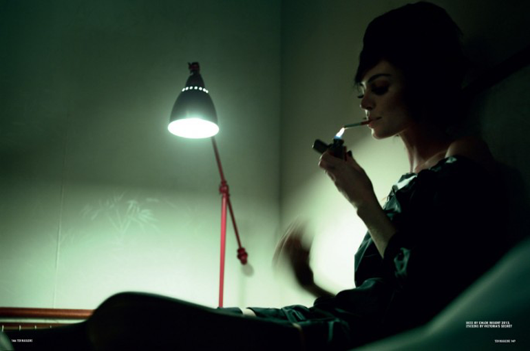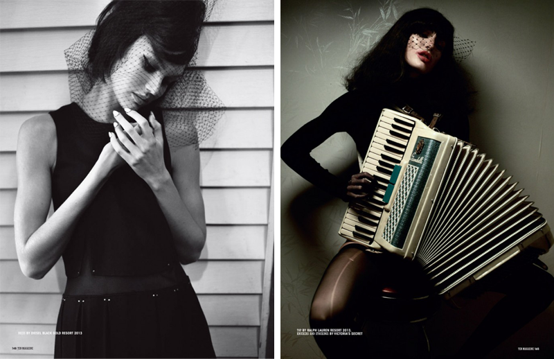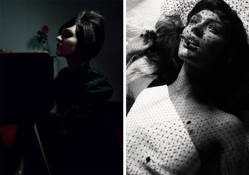


Gregory Harris ‘Candice’ for 10 Magazine Winter 2012 featuring Candice Swanepoel
Firstly, sorry for the lack of outfit posts this week, I’ve had a bit of a cold & have been looking quite a mess – think squinty eyes & a puffy face from swollen sinuses! Nice! I have also spent most of the week laying around feeling sorry for myself in my One-Piece, so hardly outfit post appropriate!
I’ve been meaning to post this editorial since I came across it in 10 Magazine last week, it’s been a while since an editorial stopped me dead in my tracks, but this one did just that. The editorials in all the big fashion magazines recently have had me skimming past them, leaving me feeling so uninspired, which made this one stand out for it’s beauty even more. Has anyone else had that recently?
Gregory Harris’s use of lighting here is just beautiful though, combined with the retro styling that still feels super modern, the moody atmosphere & the lovely Candice Swanepoel, it’s utter perfection & it’s no surprise that it stood out to me.
PS: Don’t forget to enter the Dream Black Dress Giveaway where one of you will get to design your dream dress & then have me custom make it just for you!


Maria says
WOW. Absolutely beautiful editorial!
Maria xxx
Victoria says
The net definitely brings a lot of personality to this photos, I agree with you, sometimes I found the editorial better in smaller magazines than big ones, they tend to be more creative and interesting! Congrats! in your first blog year and keep the good work :) I really enjoy reading your blog! The model looks a bit like you :)
FAIIINT says
Yes, totally agree! I’ve been reading way more smaller more independent magazine recently, they feel much more creative than the bigger ones which are all starting to feel very commercial & boring to me, I’ve already stopped buying Vogue because I don’t enjoy it anymore! Thanks for the congrats too! :)
styleflakes says
this editorial is absolutely amazing!especially the first two photos!
xxx
Amreen Dhurue says
The editorial is just amazing!!! You have a wonderful blog! :)
http://beamoazed.com/
http://beamoazed.com/
FAIIINT says
Thankyou! Really appreciate that you enjoy it! :)
Jenny says
What a beautiful editorial! I love how simple it is which lets each component shine out on its own. The netting over the models’ faces really adds another dimension to the whole thing as well! Love it. I hope you’re feeling better now! xo
http://www.jenventure.blogspot.co.uk
steph says
amazing photography! the smaller magazines always come up with better editorials, i totally agree – it’s also mostly because of a smaller budget that forces people to be more creative, that can’t be a bad thing :) definitely keeping a lookout for 10 magazine.
Lenne says
I’ve been feeling the same way for the past year!! I used to be so inspired by magazine editorials, but this year (and the last, really)… just nothing.